Case Study / Logo
I invite you to familiarize yourself with the presentation of one of the completed logo designs. In this case, I focus mainly on the graphic presentation of initial logo proposals. Gathered into one presentation as it is usually presented to the client.
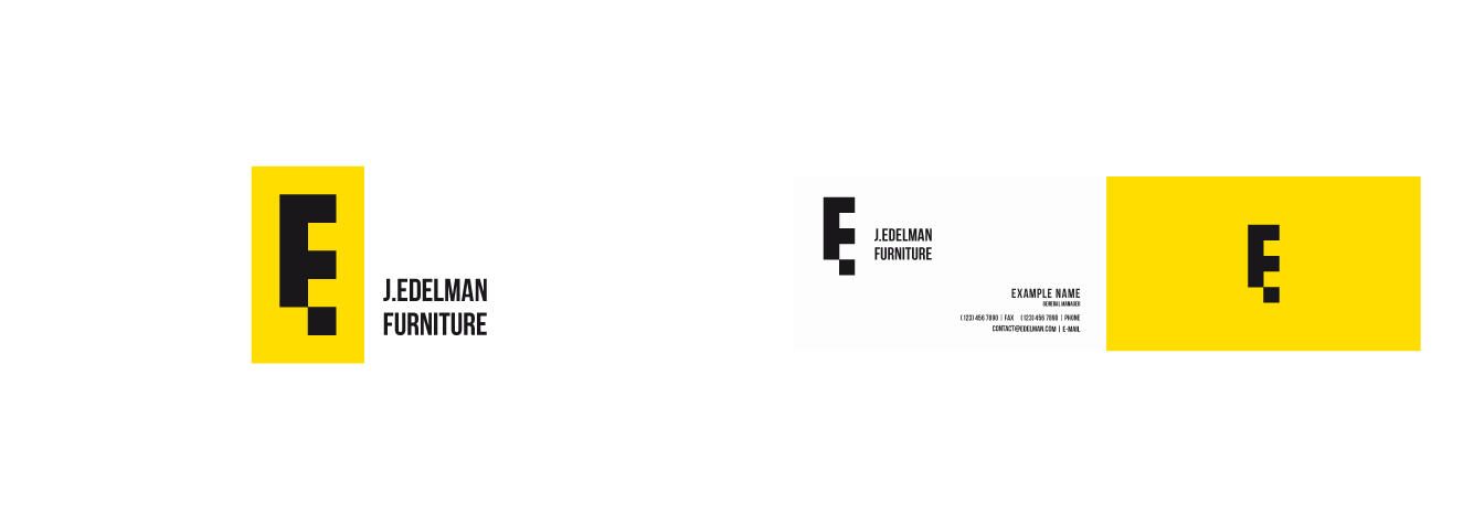
In some cases, the presentation files are in color. Presentation in shades of gray is the standard at this stage, and it usually works best.
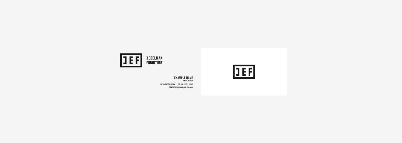
Examples of advertising materials, e.g. business cards, are only an illustrative example, they do not have to look exactly that way at the end of the work. It will depend on the direction in which visual identification will be developed.
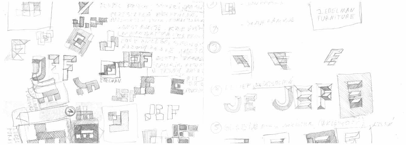
The company / Brief / Concept / Sketches
In this case, the process of creating a mark for one of the family furniture companies is presented.
The company is distinguished by modern, original solutions in the furniture industry.
It should be noted that work on each project always begins with a conceptual process preceded by the creation of a brief.
Here, these stages, information on all initial assumptions, marketing objectives, data and materials from the customer, as well as the conceptual work done and initial sketches, or finally customer feedback, are not published. However, I added a short comment to facilitate the reception of the presented content and present the most important assumptions.
Usually, for some ideas, several derivative versions are created, but it is important to present the client with the most unique and different concepts at this stage. If we decide on a specific path, then in the next stage the chosen concept, if necessary, will be developed.
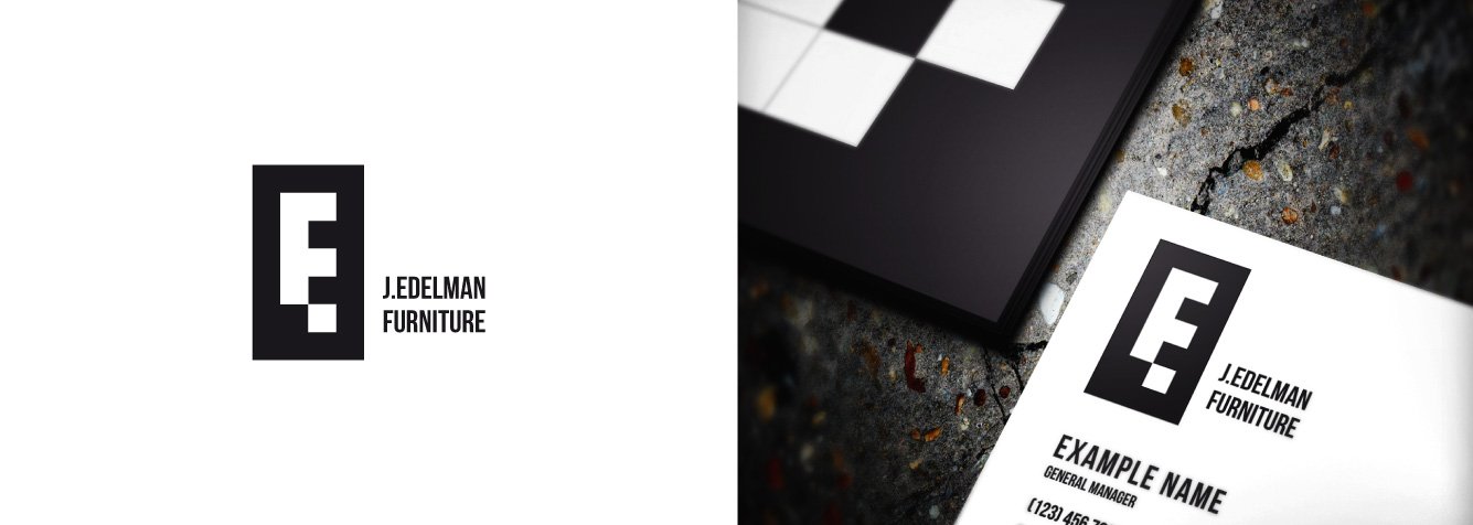
1
MONOGRAM / E F / Combination in a minimalist style of two initials of the company name in one sign / monogram.
The elements that make up the shape refer in some way to geometric blocks, prefabricated elements that are associated with this particular company. Which was a natural development of the conceptual work and sketches.
The composition somehow places the E mark in the resting position in combination with the element created by the negative, indirectly referring to the company’s products.
Both “E” and “F” are recognizable, together they create a strong, well-memorable sign.
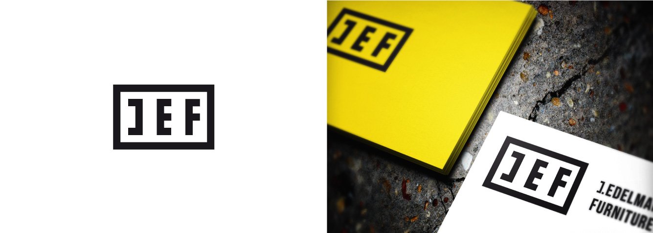
2
Monogram / J E F / Three initials with the expanded company name. In this case, the same form could also be shortened to two characters, although this is not illustrated. The best, most consistent options are presented.
A concept in a similar style to the first one, which is a development of a completely different idea. A very simplified, characteristic and expressive form.
In addition, the composition of the letters and their shape evokes associations with products from the company’s offer.
3
The proposal is a response to separate conceptual assumptions about the properties of the mark.
A proposal with three-dimensional text, more realistic as much as possible in the logo.
And the second related proposal, developed in a different way, more minimalistic. A compromise between 2D and 3D forms.

4
Full name in the logotype.
Then variants including borders creating a more traditional and non-standard graphic form.
As a result, some elements could become separate, referring to the company’s products, recognizable elements of future visual identification / icons, etc.
5
Examples of typographic differentiation.
6
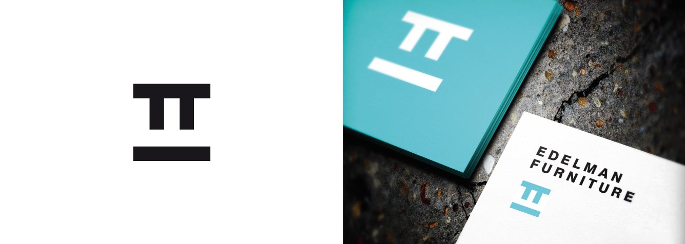
Another suggestion of the mark. Form also built by negative space.
7
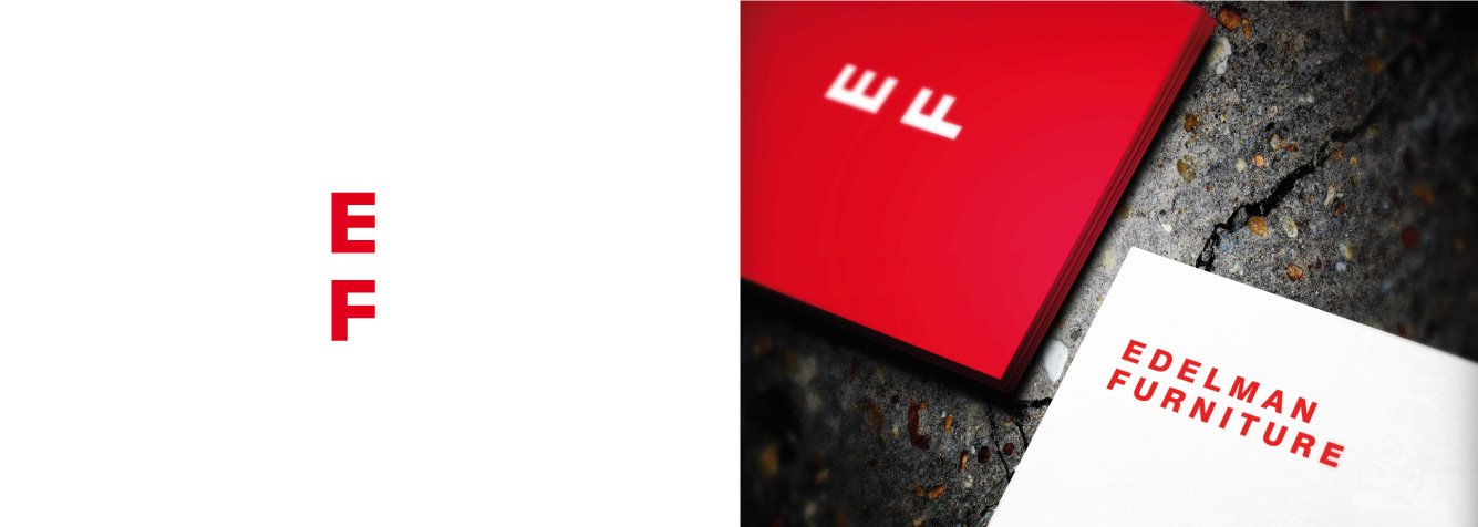
Examples of a simplified form that will give future identification many possibilities for the final shape.
And so from the variant containing the full name, to build and strengthen associations for the simplest recognizable form.


Final
If there is acceptance of a specific concept, or a decision to develop a specific path from the first presentation, there are always some modifications in the next steps, refining the concept on the basis of customer feedback.
If the choice turns out to be obvious, we will continue to work on complete identification, and depending on the arrangements, the book of the mark and other related projects.

Summary
In summary, what characterizes each project is the focus on the future implementation of the logo and all the resulting elements of identification, is simple and trouble-free.
With many advertising media, many printing and Internet restrictions, many presentation sizes, there will always be new challenges. However, depending on how well thought out and coherent the whole visual identification system will be, it will depend whether we add time and resources to the next redesign of the whole.
Leave a Comment